Currently 1 visitor is viewing this site.

Designing Calm Technology: Web Presence - Presence Web

“Our objective is not the expression of knowledge or information, but the living world itself. We want to come in contact with other people and the living world, not IT equipment or interface design - they should be nothing more than the medium.”
Yoshiaki Nishimura, 1999, Sensorium.org


This section presents my current research into Calm Technology, in the form of presence indication on the web. Making the visitors of a webpage and the authors of a webpage aware of each others presence - beyond the intrusive communicative properties of the realtime, pervasive web.

Watch a short video how the curtain visualises a visitor. (3.2 MB)

image link

Image: Calm Technology: Visitors arriving at the website are indicated by the curtain billowing gently in a momentary breeze, just as a real visitor to the room would.


But what is "presence"? How do we experience presence? Is presence created with technology a question of bandwidth? Is it necessary to simulate presence as realisticaly as possible to accept it as "real"? What is the relationship between "real" and "simulated"? Can realism be the final goal in creating presence?
In the history of User Interface Design we have seen that real-world metaphors can be confusing and only take us that far. The "desktop" with the "trash can" is a metaphor that works only as long until one tries to unmount a volume. It has to be dragged to the trash - although we do NOT want to delete it.

During the recent years the connection between the authors of a webpage and their audience has become much closer and immediate then ever before. Easy to use blogs have given writers a personal voice - and the reader/visitor can instantaneously respond by making a comment, sharing a delicious link with their own network, add the author to their own blogroll or subscribe to their RSS feed, have their twitter stream sent to their mobile or listen to their podcast while offline. (Amongst others.) At the same time Technorati or Feedburner provide the statistical tools to learn more about this audience. Yet this is all about communication. This research is not primarily about textual communication - but about presence indication and experiences of connectedness with a virtual visitor; This includes cues about contextual information to both parties so they may get an enhanced sense of each others presence on this website and context beyond intrusive communication.

Keywords: ambient display, awareness display, presence indication,

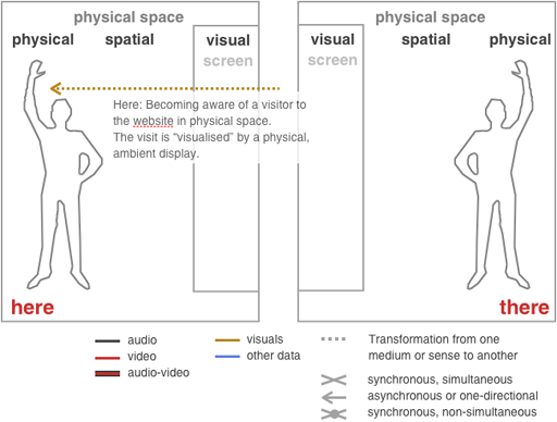
Visualising a website visitor here in physical space

Figure: Here: Becoming aware of a visitor to the website here in physical space.

How may we become aware of someone visiting our website at this very moment? Of course there are statistics-tools to visualise website-traffic, search-queries and such, in realtime, but I am not interested in a tool for analysis but a "display" that is not screen-based and less cognitive or rational then numbers, graphs and charts, but more emotional and sensual. A presence indicator or awareness display with ambient qualities in the office space. For example this could consists of a ball dropping into a bowl every time a visitor accesses the website - or a curtain blowing in the breeze of a fan reminding of a person entering the office space.

Why is this important? It is about becoming aware of a visitor being on the website - creating a vivid experience of being connected with this remote person, with the reader - but beyond the intrusiveness of communication. For the people maintaining and updating the website this can be a rewarding and encouraging experience.

The social exchange is still taking place via face-to-face, the phone, skype, comments or via email. But these are utilitarian, pervasive, analytical and my interest lies more in the subtle and sensual areas of technology and design.

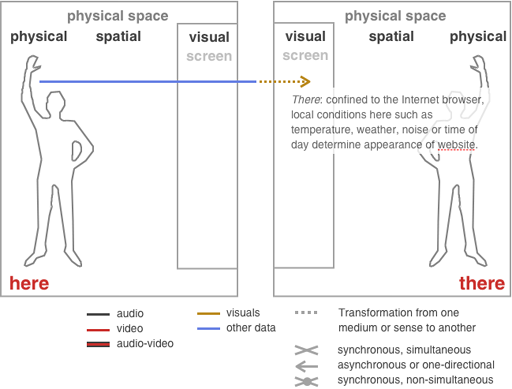
Using the website to visualise contextual information there.

Figure: There: The visitor tacitly becomes aware of local conditions, such as day or night, which ambiently effect the appearance of the website, thus providing tacit contextual information for the visitor.

The visitor is provided with contextual clues relating to physical, geographical conditions related with the website. It is not located (or better dislocated) in an abstract virtual space but actually connected to/symbolised by a place. This place has different weather conditions, day or night, Summer or Winter or other geographical properties. Just as here on this page the information on the upper left communicating the number of visitors to this website adds to its aliveness and vibrancy this contextual information may be perceived as qualitatively adding to how people experience it.

The basic idea is to systematically explore a variety of channels - directed towards the visitor of a website, and the owner of a website - in that they may become aware of each others presence or context in ambient and non-intrusive ways. This is about an ambient and gestural quality - less about precise social information or communication. These are served by various other channels such as twitter, comments etc.

This research project is currently in its initial stage and based upon the world wide web. It attempts to create a connection between the physical world and online activities such as visits to a website.
In that respect it concerns aspects of place and presence adding to transparency between remote parties separated by a geographical distance. One being the visitor of the website who is provided with ambient, tacit cues about conditions at the geographical location that is represented by the website. The other being the place the website is located at, for example an officespace in a design department, and where generative, physical and ambient displays will communicate the presence and actions of visitors upon the website. The practice-led research project attempts to investigate degrees of transparency to the opaque window that the webbrowser is and allow the remote parties, the visitor and the visited, to a certain degree to become aware of each others presence and context.

Some examples for presence indication on websites, web activity displays will be presented here. An emphasis is given to ambient and non-intrusive applications which function in non-verbose but sensual fashion and point both ways. Applications of agency or dedicated communication are explicitly not intended. There also is a fine line between visualising network activities or emails (as we see in the examples/context section) and direct reactions to context (day/night) or visits (to the website).

Initial research questions:

How much transparency is useful? How much opacity is necessary? Which indicated states are meaningful for recipients? What is the balance between an intrusive display and ambient qualities? What are the most transparent mappings for conditions and actions? Do these mappings have to be direct to be perceived as meaningful?

One hand clapping on the web: What does at visit to a website sound like? What are adequate means of "visualising" this event?

Current Web 2.0 technologies provide an enhanced sense of connectedness between the owners/operators of a website, especially a blog, and their audience. Twitter updates about the spirit in general, whereabouts and plans. Readers can immediately respond to a blog asynchronously either via a comment or on their own blog. Blog owners provide a social context with the blogroll. That there are readers is shown by the statistics of technorati's blog reactions as well as feedburner. Sometimes also in displaying the number of users or member online. This adds a vivid sense of presence.

last update: 4/21/02020 14:54

About Contact Disclaimer Glossary Index